Brewing up a booming brand from scratch.
Buoy’s founders had a vision for their new craft brews: make them feel like they’d been around forever. Diving deep into the team’s purpose and their vision for community, we landed a brand and origin story that felt uniquely familiar, fun, and immediately iconic.
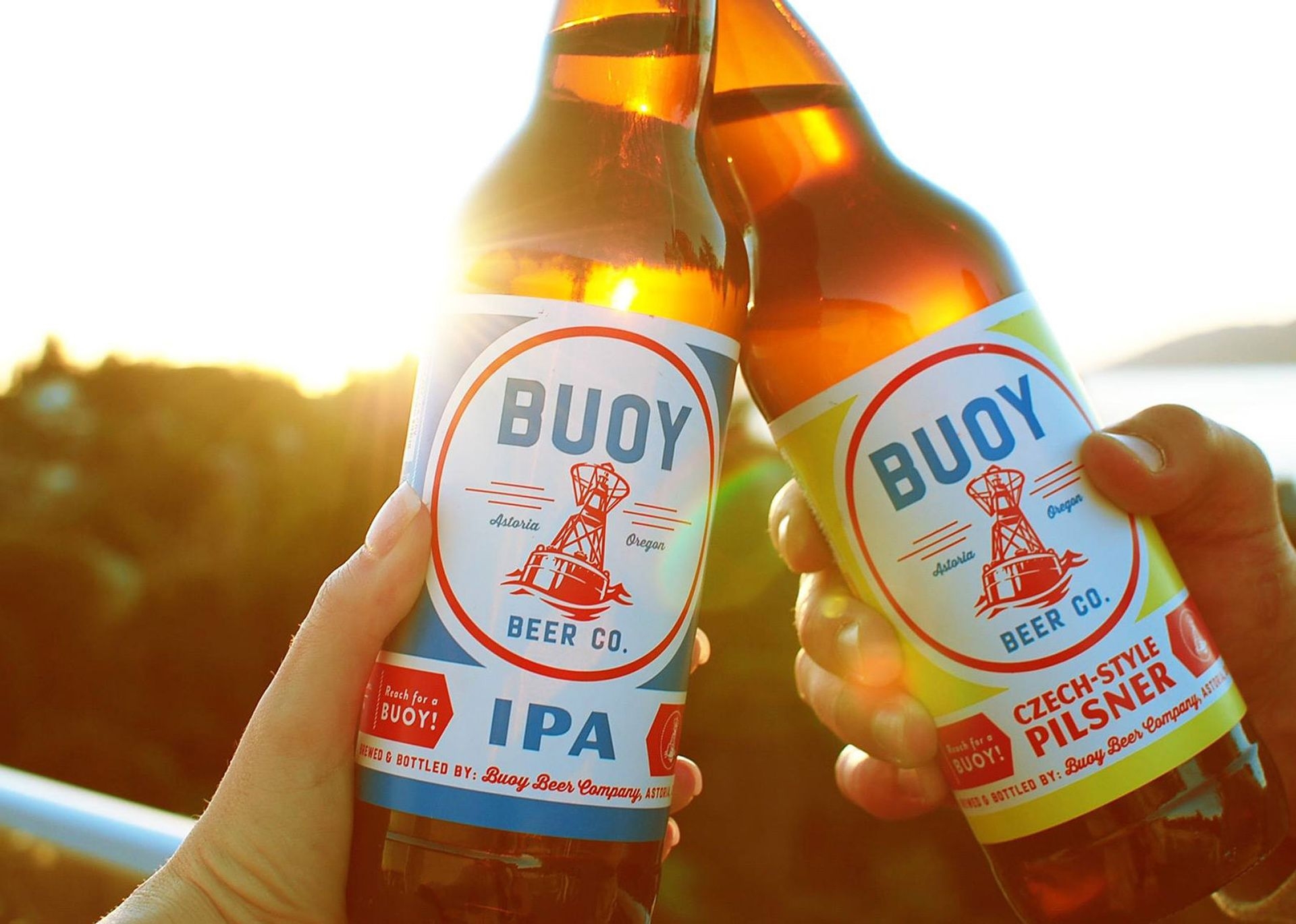
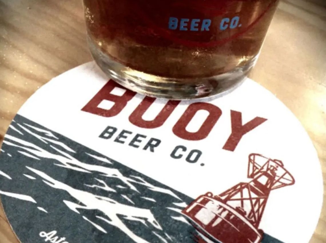
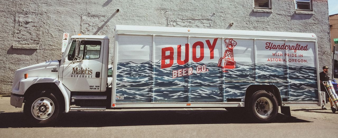
From naming, to logo, brand identity, and overall packaging design — Astoria’s colorful history and local character informed key elements that anchor the brand’s appeal to hearty, no-b.s. locals and adventurous beer lovers alike.
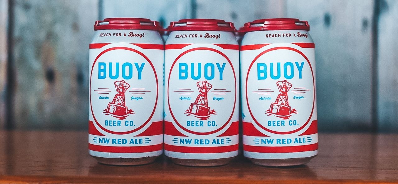
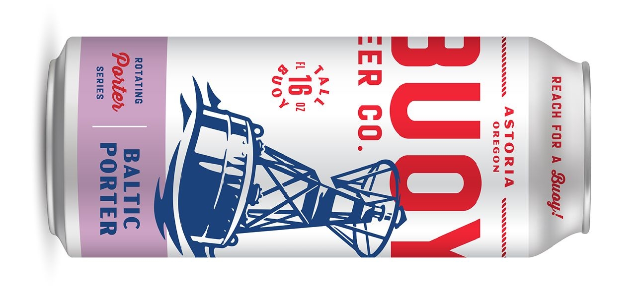
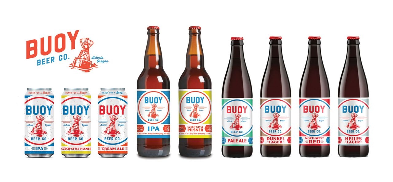
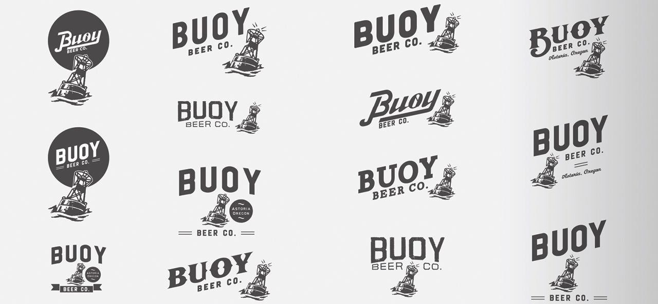
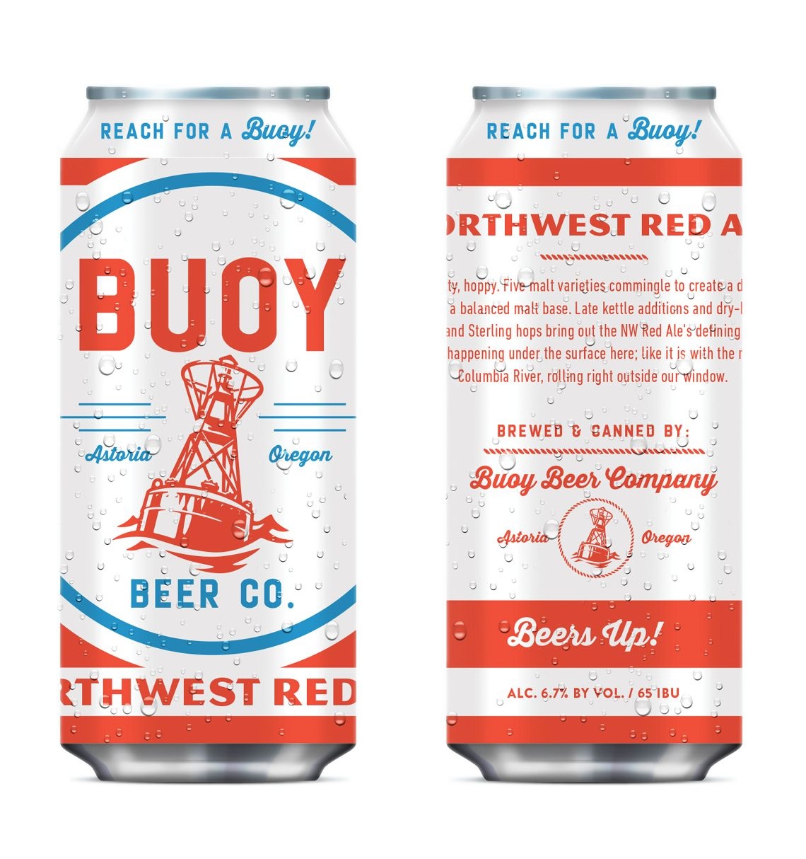
Buoy’s classic logo is prominent on year-round and seasonal release 12oz cans.
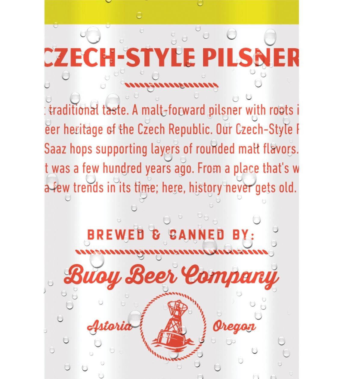
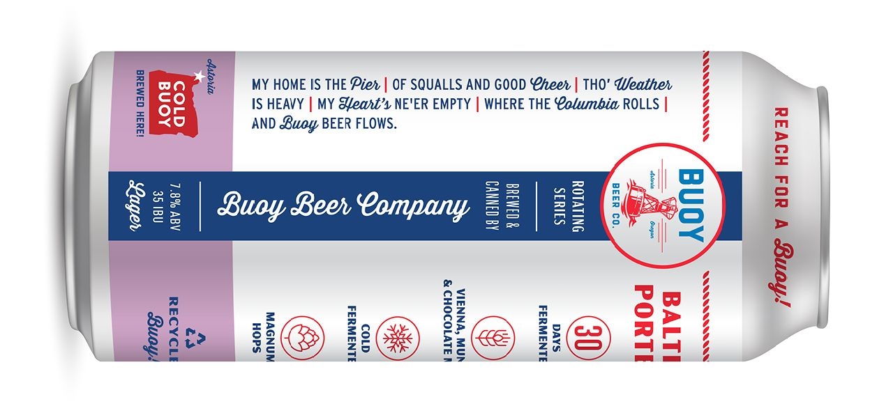
Seen on the side of the can or read as a longer form anthem, Buoy’s brand voice evokes a pride of place. Bold, no-nonsense; punched up with a hint of storytelling whimsy. It captivates and pulls you in.
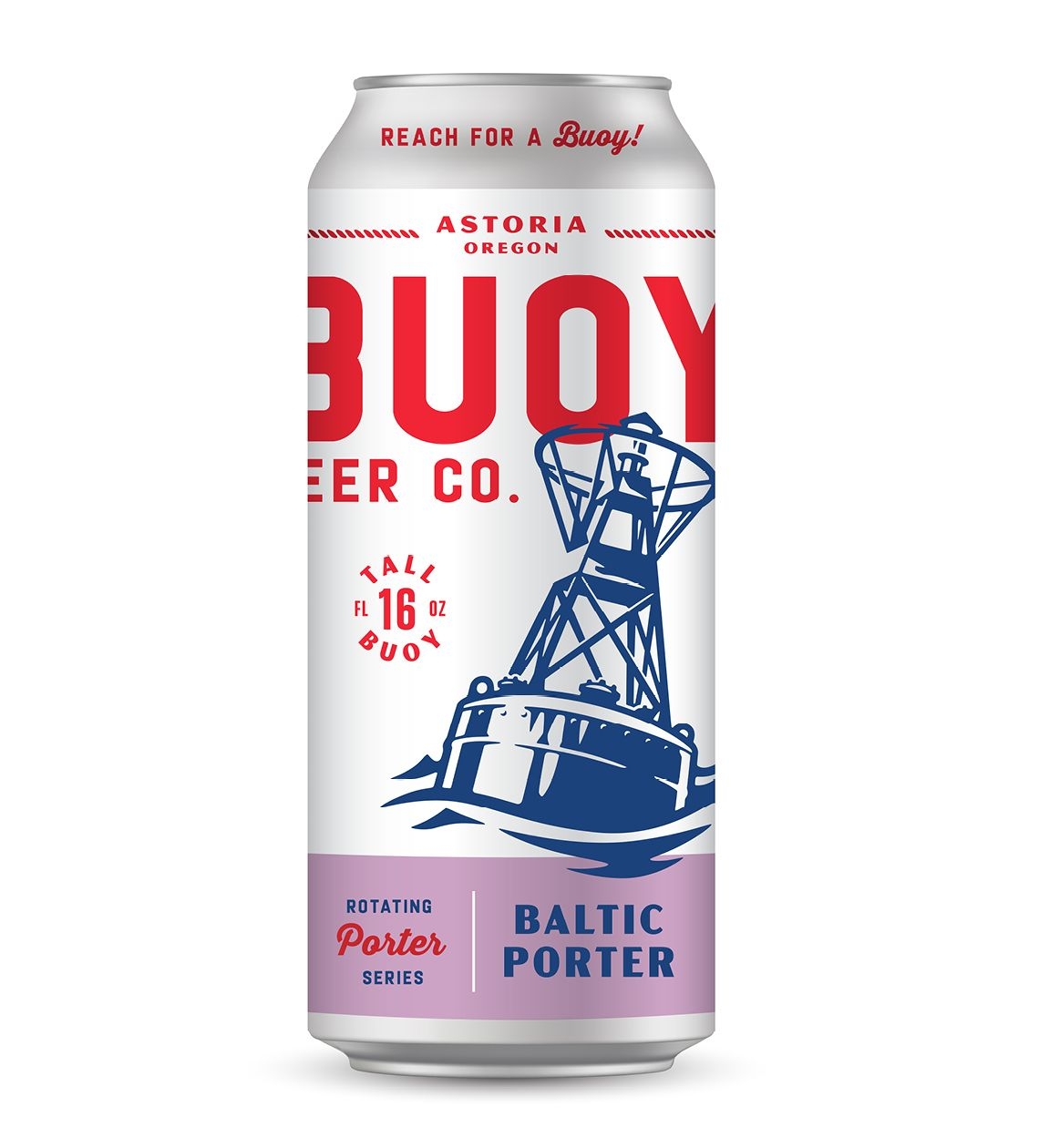
With larger 16oz cans (“Tall Buoys”!) introduced for special releases, we treated core identity elements to a remix – a thoughtful extension of Buoy’s signature brand DNA.
Grady Britton designed Buoy Beer's new 16oz can look for our seasonal beer. Their team helped break us out of our comfort zone to create something that fits flawlessly into our can lineup.
Buoy Beer Pong Fury
Buoy is the official sponsor of good times. And if that means sponsoring a city-wide beer pong tournament? Bring it. Beers up, y’all.