We were thrilled to select Friends of the Columbia Gorge as our 2019 grant winner, providing the organization with $25,000 in-kind marketing and branding services.
Created in 1980 due to mass urban development encroaching into the Columbia Gorge, a group of citizens led by Nancy Russell officially formed Friends of the Columbia Gorge. By 1986, they secured federal legislation to protect the area under the Columbia River Gorge National Scenic Area Act. Since then, Friends works with government agencies and other groups in both Oregon and Washington state to ensure private land is brought into public ownership (over 41,000 acres since their founding). They remove non-native species, replant native vegetation, and protect fragile resources on land trust-owned properties. They review development applications, lead education programming, and just downright protect the irreplaceable land and its resources.
They’re darn good dogooders.
 After the devastating fire in 2017, Friends received a lot of attention and donations to help clean up the damage. The community was hurting. The land literally burning. But their work? So much more than repair; it’s about protection in the first place.
Friends operates as leaders-in-service to multiple communities — atypical to other conservation nonprofits, as protection of public lands is only one aspect of what they do. So after the fire, they emerged as the voice of reason and leader in the region, for diverse stakeholders with varying interests — some at odds with one another. It became clear we needed to help Friends understand what themes and insights were a key priority for who they were as an organization, as well as for their various audiences. We led brand workshops to surface and galvanize strong ideas and opinions so our brand positioning and thinking moving forward was aligned for them internally.
Friends then had their why. “To keep the Gorge a vibrant living place — wondrous, wild, and open to all — for future generations.” So we shifted to the creative expressions, or their how— voice, messaging, and an updated visual identity. As leaders not only in the wake of a crisis, but for future generations, we sought to enhance the vibrancy and versatility of the organization.
The descriptive name is something that worked in our favor. Friends of the Columbia Gorge spells out the who, so the messaging could lean on this, rounding out the story from different angles.
 We also explored the rich territory of tone of voice. Friends staff needed guidance on best practices for communicating with all of its constituents, in practical, colloquial terms. We provided conversation-starters and short scripts based on themes highlighted in the workshops.
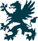
We also created a new illustrated logo. Due to the holistic approach of the Friends organization, their competitive landscape was quite complex. We had to consider a wide variety of contending entities in different industries when it came to design. Their existing identity did not convey the scope and professionalism in which Friends operate. So part of our creative challenge was to not only deliver a brand identity system that was distinctive in their field, but to demonstrate a level of validity to their audience. We also saw an opportunity to craft something aesthetically modern and future-facing — which none of their competitors were owning. Ultimately, our strategy was to build a brand identity that was simple, recognizable, and authoritative without sacrificing the friendly aspect of the organization.
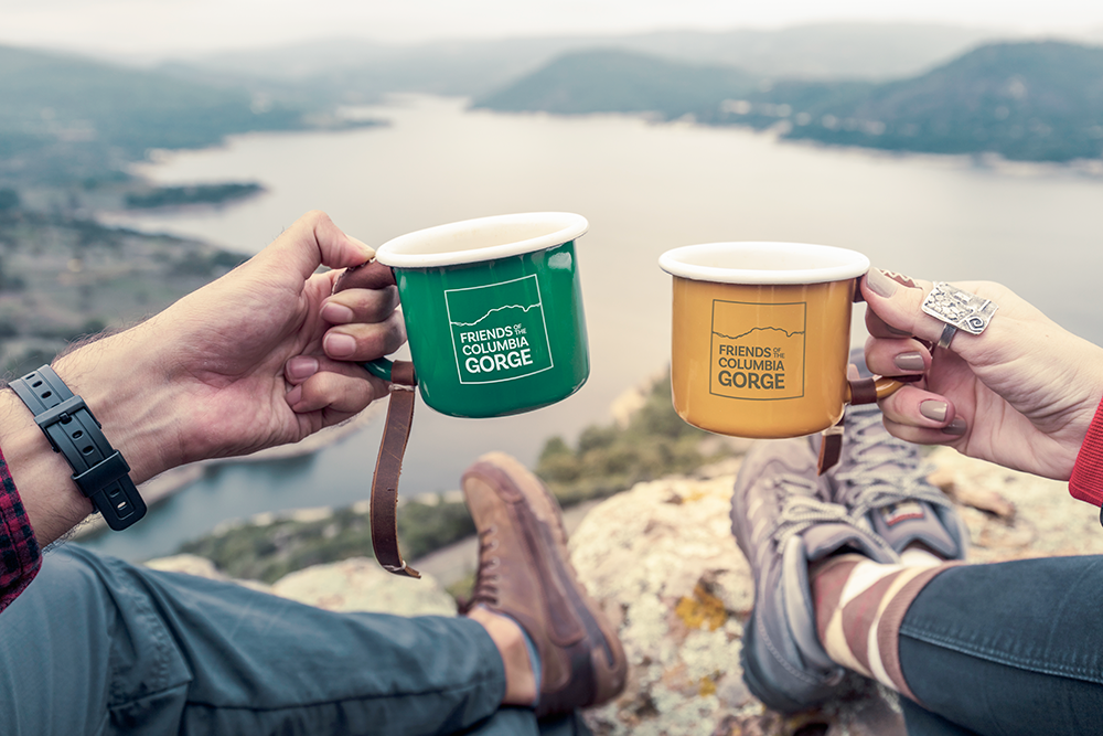
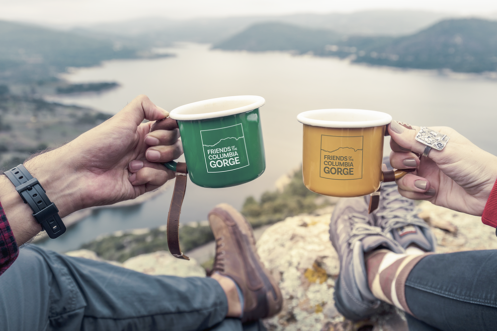
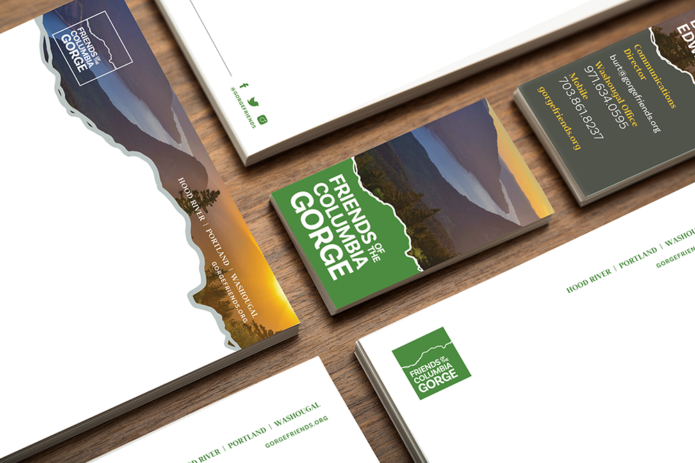
With that, the new logo conveys trust and protection. A square communicates the non-profit’s holistic approach to its conservation work, and within, an illustration of the actual Columbia River puts the brand in place. A new font uplevels the organization’s presence and authority, leveraging the approachability of san-serif but adding structure. The look is intended to echo the name itself, adding a sense of friendliness while curves speak to the movement of water. And perhaps you’ve noticed: the “G” also mimics the recycled symbol.
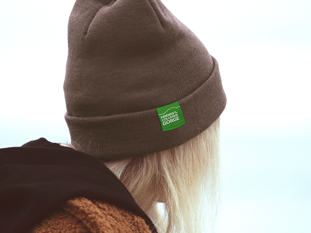 The color palette represents the vitality of the area: bright grass green is the Gorge’s springtime color, and felt like the right pick for the new look. Subsidiary logos include a brown, canyon-like color, along with a blue to match the river — all in tune with nature. By matching pantones to the photos taken of the Gorge, we found a way to bring nature into the Friends’ brand.
As Friends works to promote and safeguard a higher vision for the Gorge, the organization is also tasked with gaining the trust of multiple audiences — from donors to recreationists. Preservation. Protection. Trust. Advocacy. Pride.
Friends devotes so much to our community and to our region, protecting an area we are all lucky to explore and call home. They’ve been here for 40 years, and we feel privileged to have helped them come into this anniversary by working together through a brand refresh. This organization’s mission is exactly why we started the Grady Britton grant program 10 years ago, and we are proud to have partnered on this, all while pushing Friends toward something broader and bigger, bringing the importance of their work to new generations.