
Forward Greens is a company out to do good and sow simple, approaching farming through the joy of it. Our partnership began when they were still known as West Village Farms. They wanted a new brand, and needed to bring what they stood for to life. And get consumers on board, too.
 A discovery session with stakeholders helped us prioritize the mission and the new brand go for — joy! We wanted something happy and human, especially because their competitors (other vertical farms) come from a brand position of high-tech. Sure, it’s how they farm (growing a fields-worth of greens in a warehouse-worth of space). But it’s not why. With this vision, we started thinking through new names, eventually picking the one that communicated a radically simple idea — one that says it’s time we treated our place here, in this little world, with a little more dignity. One that says we farm food, as fresh as nature would make, that asks the least of our resources. One that says things are moving — and we’re about it all moving the right way. A name that represented a drive to be innovative and a will to be ambitious.
Forward Greens.
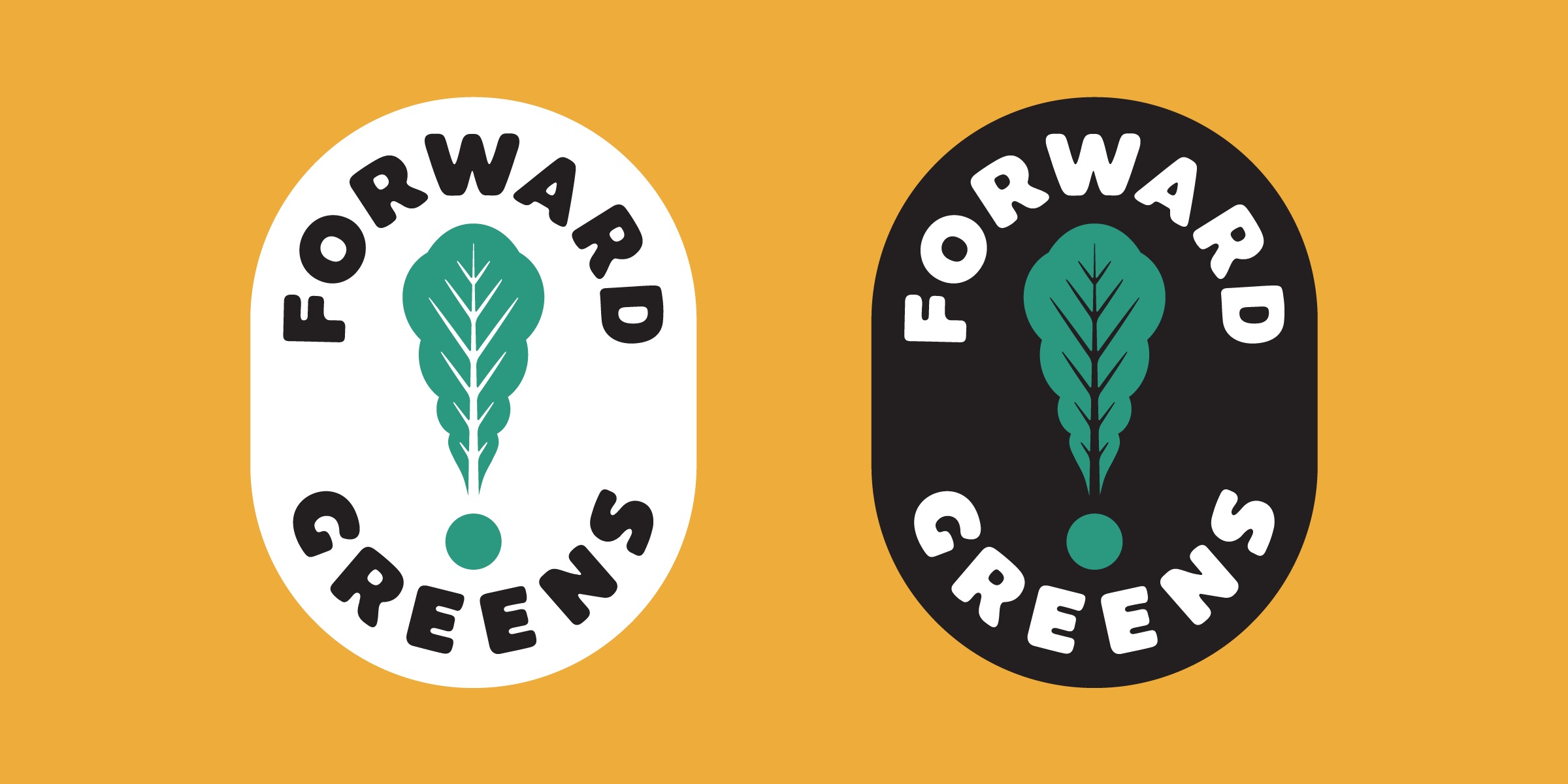
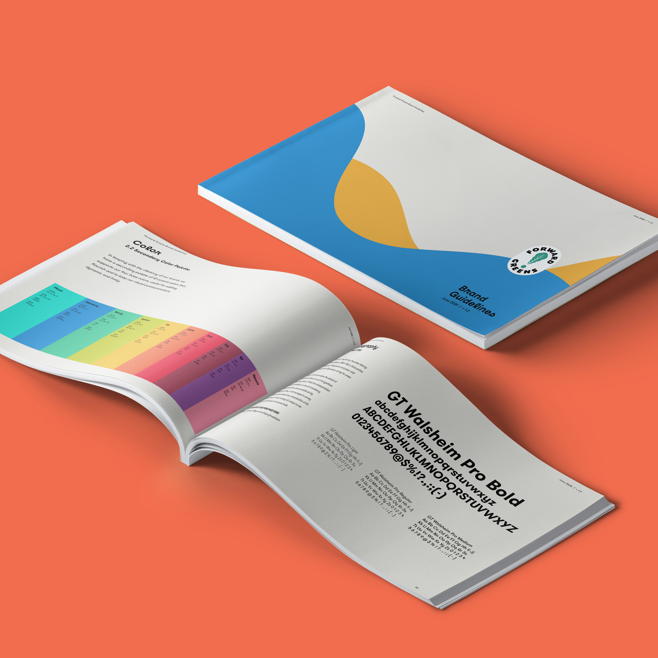
Forward Greens farms for the love of community, food and the planet. No pesticides, no GMOs, no nonsense — just 19 days, on average, from seed to shelf. To illustrate that, the new logo is designed with rounded typography and subtle imperfections, a crest that nods at tradition, and a leaf that looks a little like an exclamation point. It sparks that joy. And outside of the brand’s primary palette of black, white and green, it’s vibrantly colorful, with a secondary palette of 10 accent colors.
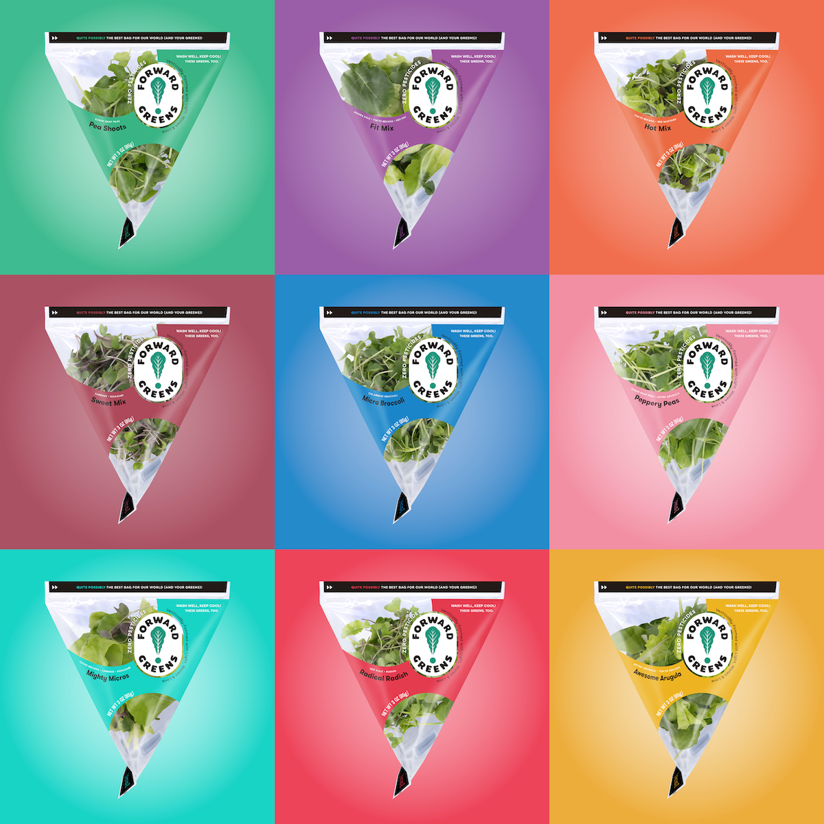 When the time for packaging came, we knew bagged-lettuce is a crowded market. Produce aisles are filled with options, so this one needed to stand out. Selected after a lengthy packaging search process to find the smallest footprint possible, something sustainable and something that offered a simpler production process, the tetrahedron took the win. It’s a completely different look for the produce aisle, and a stark change from the West Village Farm clamshell.
Working with the shape, though, was a challenge — with no clear front, back, top, bottom or even side. But wanting movement on the bag, a creative exploration included hand drawing shapes to test how they could wrap the bag until they aligned in a way that made visual sense…and wasn’t so awkward. We found one. To communicate that this is a small brand, local to Washington and Oregon, we also included Forward Greens’ Founder Ken Kaneko’s signature and illustrated photo to personalize the package.
 While every food category has a certain vernacular, the design for Forward Greens breaks the rules. This new brand design stretches accepted notions of produce packaging design while ensuring the product still looks appetizing (kinda important). Plus, we left room to still be able to see what’s inside. People want fresh.
Across our eight months of work together — we’re talking brand discovery, brand anthem, rename, logo, colors, typography, packaging, copywriting, brand guidelines — we accomplished what we set out to do, and made produce aisles a little brighter. Forward Greens is now available in all premium grocers in Oregon, with 26 new retailers in Washington.